Saturday, June 25, 2011

"Overdone" Teal Bedside table

In a recent trip to one of my favorite spots in the world, Canton, Amber and I found "THE" bedside table!! It pretty much rocked our world.


Isn't amazing??? Now you see why our task at finding one that was equally as great for her husband's side was going to be a challenge.


So, in the hunt for the perfect bedside table for Amber's husband Josh, we came across a possible contender at a cute boutique called Spice. The only thing wrong; it was an awful shade of teal. But don't let color or knobs be the deciding factor in choosing furniture. I love taking ugly furniture and making it a completely different looking piece. Paint and hardware do wonders!!

This is with a light spraying of Churchill Hotel Vanilla by Valspar. So imagine a darker shade of that dreadful teal.

After a heavy dusting of paint, I took my trusty sanding tool and went to town on all the edges. Making the edges look roughed up gives you the automatic look of worn and gently used. So if you do nick it or scrape it you don't have to worry about messing it up. Not like when you buy a new car and then watching a shopping cart roll into it. I have a friend who automatically takes his key whenever he buys a new car and gives it a little scratch. Takes the disappointment right out. (ADD Moment) :)


After I sanded, I wiped the table down to get rid of all the paint and dust and prepared it for the stain. I love to use minwax. It's the best stain out there. 
This is best used on a rag wiping heavy where all the sanding was done and then lightly over the whole table. What you get is the opposite of a white washed affect. 

We were very lucky to find that this piece had a beautiful iron drawer pull. After a lamp, some old torn books, and a few accessories, you end up with an exquisite piece of furniture. A masculine piece in a more feminine master bedroom.
Thoughts?????

Thursday, June 23, 2011

Hmmm, Martha Stewart.....

What are the first things that come to mind when you hear Martha Stewart??? I'm sure their are plenty of adjectives and visions of rage from all the horror stories, but when I think of Martha, and I often don't, I think of clean, crisp, high class and high style. Most of which are true, but I stumbled upon her official blog this afternoon and I couldn't help but be disappointed in what I saw. She posted several entries that were from her farm house, her house in Maine and her home home. BORING! She is boring, everything is the same color, very monotone. Monotone can be done correctly and have a great look, but I was seriously disappointed in the way her houses looked. Not that it matters to me, but it's like opening a Christmas gift that you expect to be this fabulous new outfit that is very "in" but turns out it was your brothers hand me downs. Talk about letting the air out of the balloon.

To give her credit, she has like a ton of homes, and decorating them must cost an arm and a leg, I mean she does a have a BIRD ROOM!! Yes, a room dedicated to Canaries.

Judge for yourself....You have to do a little digging in her photo album
http://www.themarthablog.com/
Shows her Holiday Decor
http://www.themarthablog.com/2009/12/as-promised-an-exclusive-peak-at-the-holiday-decorations-in-my-home.html

Wednesday, June 22, 2011

Center Piece of a Master Suite

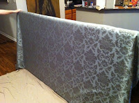
When talking to my friend/client, we decided to undertake the idea of creating a king size headboard!! I believe we were having a moment of insanity and in the end I had spray glue all over my floor, scraps of material everywhere and a headboard that had to weigh 100 pounds in my living room.

The first thing we had to do, and anyone looking for inspiration, was find some fabric. It only took one trip.........


Fabric on the left would become the curtains and our headboard fabric was the pretty print on the right. It makes the room very relaxing and calming when you see it. 

Getting measurements for this headboard are crucial! If we had misscalculated on material it would have made for an awful night. I wanted to use plywood but upon inspection we noticed that every piece was warped. We went through at least 6 different sheets before we decided on a different material. Plywood is very hard to work with and I didn't like the idea of MDF since it is very heavy but because there were no imperfections I felt it would work perfectly. For those of you that don't know us, you have to picture 2 people in a maze with no directions. We were wondering around Home Depot looking for tools and gadgets, asking questions and trying to describe things with no correct vocabulary. We even had workers trying to help us find things we were describing what we thought it should be called. It was pretty comical when a designer is telling an 18 year that I need a support bracket for the back of the MDF and him showing up with at least 8 feet of metal tubing. Not at all what I needed. Literally, after a few hours, we were out the door with everything.

When we returned to my studio, AKA my living room, everything had to be cleared out to make room for the massive project. I laid a sheet down to protect the fabric from getting any dog hair. My assistant, Jackson, is a Golden Retriever that weighs 90 pounds and loves to lend a paw when needed.

The process is pretty easy after you have everything you need. It's like making a ham and mustard sandwich, layer after layer after layer. We started with the MDF first. Sprayed lots of adhesive on it at close range. This is very important, the more you have the better your batting will adhere. I used 1.5'' to make the headboard thick and fluffy, you don't want to lay in bed and hit your head on the MDF. Not very romantic, huh? After we let that sit and dry we picked up the MDF and then laid the fabric printed side down. Maneuvering the headboard on top is the tricky part, especially if there is a complicated design on the front. once your MDF is in position, I started stapling the headboard from the middle out towards the corners.


As you can see from here it looks pretty easy, stapling as you go.  I put in two rows of staples to make sure each side was secure. Be careful on your corners, make sure you round each of them off to make for a chic look. The more square look the modern feel you will get. Trim any excess you may have. This helps when you are hanging and need all the eye room possible.  I use two mounting kits and screwed as many of the screws into studs as possible. The other screws must have anchors!! Very important to find studs. (you already found me) :)


After many trips to Hobby Lobby and Home Depot, meeting new friends along the way, we have an incredible center piece.

Monday, June 20, 2011

Quick Fix of an ugly bench

Keep in mind this is my first blog site and my first official post. A friend called me up and asked if I could help her "re-decorate" the disaster that is her master bathroom. I said yes, because I love to help the disadvantaged.  :)

One of the key elements in my design for her revolves around a cute little bench. This bench was given to me by someone who was throwing things away and of course who doesn't love free things.                     
I LOVE FRIENDS LIKE THAT!! 

This bench was a mahogany color with a heinous floral pattern that had to be from the 70's. First thing we did was pick out fabric, another favorite thing to do for me. We chose this fabric to match our curtains for the room along with accessories and bath towels. 
This color and pattern along with the paint I chose to spray the legs works well with all the coordinating colors in the bathroom. I do apologize, it is my first blog entry, I will take more pictures of each process as I start and finish each. I sprayed the body of the bench with a great color, Church Hill Vanilla from Lowes. It is a very rich, warm off white color. Very shabby chic. The finished product came out just as I had hoped!! Very pretty.


I will post again with the finished room with this cute little bench.

P.S. I could add stain to the body of this bench to make it look more antique, do you think that would work or leave it crisp??